Showing a graph on a display with ESPHome
When you create your own sensor devices with ESPHome, you generally let them send their sensor measurements to a home automation gateway such as Home Assistant or an MQTT broker. Then you can visualize these data in a central dashboard.
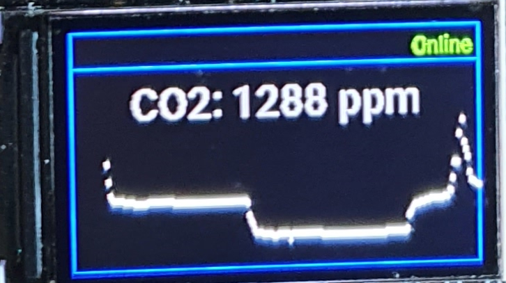
However, sometimes you want to visualize those data locally on the device itself, on a display. For instance, this year I created an air quality monitor with an ESPHome configuration. The first version just had an RGB LED for local feedback about the measured air quality, but recently I created a second version built around the LilyGO TTGO T-Display ESP32, which has a built-in 1.14 inch display. This way I can display the CO₂ and particulate matter concentrations and the temperature, humidity and pressure locally, which is way more actionable.
ESPHome 2021.10 has a new type of component that is interesting for this purpose: a graph. For instance, this is how I defined the graphs for CO₂ and particulate matter concentrations:
graph:
  - id: co2_graph
    sensor: co2_value
    duration: 1h
    min_value: 400
    max_value: 2000
    width: ${graph_width}
    height: ${graph_height}
    border: false
  - id: pm_graph
    duration: 1h
    min_value: 0
    width: ${graph_width}
    height: ${graph_height}
    border: false
    traces:
      - sensor: pm2_5_value
        color: color_yellow
      - sensor: pm10_value
        color: color_green
Note that the second graph shows multiple sensor values, each in their own colour. There are a lot more options possible, for instance for grids, borders and line types.
Then in your display component you can show these graphs:
display:
  - platform: st7789v
    id: ttgo_tdisplay
    backlight_pin: GPIO4
    cs_pin: GPIO5
    dc_pin: GPIO16
    reset_pin: GPIO23
    rotation: 270
    pages:
      - id: page1
        lambda: |-
          it.graph(0, 60, id(co2_graph));
      - id: page2
        lambda: |-
          it.graph(0, 60, id(pm_graph));
This draws both graphs on their own page, at position x=0, y=60. With a header, frame and some extra information this looks like this on the T-Display's display:
You can find the full configuration in the example file t-display_example.yaml of the GitHub repository of the project.